
Antonio Silvestre
apr 26, 2023 • 4 min read
Design av systemer blitt en viktig ressurs for ethvert design- eller utviklingsteam, og de er blitt en nøkkelelement for alle størrelser og bransjer med digital tilstedeværelse, og ikke bare teknologibedrifter. Design av systemer tilby ett enkelt referansepunkt for digital design, inkludert retningslinjer, komponenter osv.
Denne artikkelen vil gi en oversikt over Lasting Dynamics teamets måte å skape og organisere designsystemet vårt på. Vi vil bruke noen av våre interne objekter som eksempel og beskrive dem trinn for trinn.
But before enrolling in the steps, we should know what’s a design system? and how does it help?
Et designsystem er et et velstrukturert sett med felles og integrerte mønstre og prinsipper som definerer produktet og hjelper teamene med å designe og bygge konsistente og sammenhengende digitale løsninger. Det hjelper teamene til å jobbe raskere og mer effektivt ved å tilby et felles språk og et sett med gjenbrukbare komponenter og mønstre. Det er her nykommere i prosjektet kan lære å utvikle flere elementer og finne spesifikasjoner for å forstå og implementere dem.
Hovedformålet med et designsystem er å forbedre effektivitet, kvalitet og skalerbarhet i design og utviklingsarbeid. Det hjelper team med å skalere design- og utviklingsarbeidet ved å tilby et rammeverk for å bygge og vedlikeholde digitale produkter over tid.
Designsystemer er et kraftfullt verktøy for å forenkle og styrke arbeidet i et team, men det krever nøye planlegging og gjennomføring for å være effektivt.
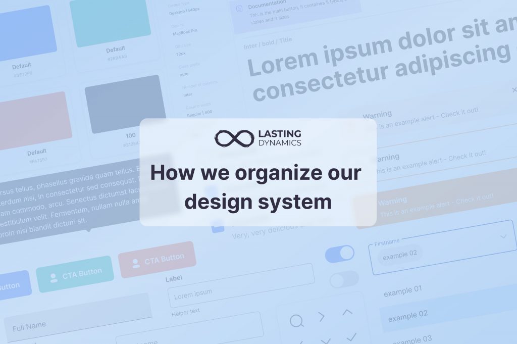
Slik organiserer vi designsystemet vårt i Lasting Dynamics: Som seg hør og bør består designsystemet vårt av følgende elementer 2 hoveddeler:
I dette avsnittet beskriver vi de viktigste delene: Farger, typografi, ikoner, mellomrom, Rutenett og Shadow som vist i visningen

I tillegg til en generell del som inneholder alle generelle komponenter som brukes til å vise elementer på sidene, for eksempel topptekst, fargeboks, dokumentasjonsboks og så videre. Disse elementene gjør det mulig å organisere sidene og komponentene våre slik at nye medlemmer i teamet enkelt kan integrere dem. For eksempel har vi dokumentasjonsboksen som brukes til å legge til dokumentasjon om komponenten når det gjelder elementer, tilstander, størrelser eller typer, eller også forklaringspilene som brukes til å peke på margene, polstringen eller andre detaljer i komponentens anatomi.

Siden designsystemet vårt er mer generelt og ikke prosjektrelatert, har vi sørget for å inkludere flere eksempler og alternativer i hver del for bedre bruk i fremtiden.
Hver komponent av disse har en egen side som er delt inn i fire hovedpunkter eller aspekter, og vi vil forklare hvert aspekt med et eksempel på Switch-komponenten fra vårt Design System :


En god tilnærming er å opprette en forekomst og teste komponenten med alle mulige tilfeller for å forstå hvordan den brukes, og sørge for å gjøre en gjennomgang av den - i henhold til vår gjennomgangsprosess - og rapportere eventuelle feil som blir funnet.


Hvis komponenten er validert etter at vi har utført testene våre på den, betyr det at den er klar til å brukes og publiseres.

Her er noen tips vi har utarbeidet for å hjelpe deg med å lage komponenter:
Teamet vårt forstår at hvert produkt utvikler seg og vokser, og designsystemet er en avgjørende del av ethvert prosjekt, og derfor er det viktig å holde det oppdatert med endringene for identiteten. Ved å jobbe med komponenter sikrer vi muligheten til å publisere endringer i stiler, farger, komponenter og andre ressurser fra systemet i løpet av få minutter, noe som vises i alle Figma-filer der designsystemet er synkronisert.
Det er likevel ikke lurt å gjøre mange oppdateringer på kort tid. Hver forbedring bør diskuteres i teamet og foreslås på idésider i en hovedfil, og dokumentasjon knyttet til denne endringen bør kunngjøres for teamet. På den måten er alle klar over de mulige forbedringene, hvordan de kan brukes og kan komme med forslag.
Med de nyeste Figma-utgivelsene er det lettere å publisere endringene dine og holde oversikt over disse endringene fra et hvilket som helst annet faktum. Faktisk er det nå mulig å bruke endringene på noen komponenter og de andre vil beholde den andre versjonen, på denne måten gir Figma oss mer frihet til å administrere komponentene og endringene våre.


Antonio Silvestre
